

As a designer, I had the opportunity to create a responsive UX/UI for Coin, a new challenger banking app aiming to make a strong impact in the financial industry. My goal was to design an intuitive app that would stand out from the crowd while adhering to the established brand guidelines. The design had to be clear, trustworthy, and playful — striking the perfect balance between professionalism and a fun, engaging user experience. The challenge was to create an interface that works seamlessly across both desktop and mobile platforms, providing a smooth, consistent experience for users. In this case study, I’ll walk you through the design process using the design thinking framework.
project
Role - UX/UI Designer
Tools - Figma
Designer - Debora Davidova
Timeline - 2025
Key Deliverables
- Domain research
- Competitive analysis
- User Interviews
- Affinity diagramming
- User personas
- User journey maps
- Problem Statement
- Design principles
- Use case scenario
- Formative testing
- Information Architecture
- Style guide
- Colors
- Typography
- Icons
- Lo-fi Wireframes
- Hi-fi Wireframes
- Prototype
Goals
- Design an Intuitive and Responsive UI- Create a user interface that is easy to navigate and understand, ensuring usability across desktop and mobile platforms.
- Align with Brand Guidelines - Ensure the design adheres to Coin’s brand identity — maintaining a balance between clarity, trustworthiness, and playfulness.
- Deliver a Consistent Cross-Platform Experience - Provide a seamless, smooth user experience across multiple devices, ensuring functionality and aesthetics are preserved.
- Create a Unique and Standout Visual Identity- Design an interface that differentiates Coin from traditional banking apps and competitors in the challenger bank space.
- Balance Professionalism with Fun- Integrate engaging, friendly elements into the design without compromising credibility or user trust.
Challenge
- Maintaining Brand Personality Across Devices- Translating the playful yet professional tone into both mobile and desktop layouts without losing consistency or clarity.
- Designing for Responsive Behavior- Ensuring all UI components adapt seamlessly to various screen sizes and orientations while maintaining usability and aesthetic quality.
- Standing Out in a Competitive Market- Creating a distinct, memorable user experience in a space where many fintech apps already offer polished, user-friendly designs.
- Balancing Simplicity with Engagement- Avoiding visual clutter while still delivering a dynamic, engaging interface that encourages user interaction.
- Building Trust Through UI Design- Making sure users feel secure and confident using the app, especially when dealing with financial transactions — all while keeping the tone playful.
APPROACH
The Approach That I Followed
To complete the project I followed the Jesse James Garrett’s method knows as the Elements of User Experience. This method allowed us to cut through the complexity of user-centred design. W e decided to use this method as gave us the big picture of the user experience development, from strategy and requirements to information architecture and visual design.

empathise
I began by exploring the problem space to better understand how users interact with digital banking platforms. To identify opportunities and trends, I conducted a competitive analysis of leading challenger banks, focusing on features, tone, and user experience.
I also carried out user interviews to uncover real needs and pain points. Users consistently mentioned issues with confusing navigation, lack of transparency, and impersonal interfaces. At the same time, they expressed a desire for a banking experience that felt more human, clear, and engaging.
These insights helped shape my design direction, ensuring that the Coin app would balance trust, clarity, and playfulness in a competitive market.
Research
I began by investigating the broader banking sector, including both traditional institutions and emerging online banking apps. I focused on understanding the services that help people manage their finances quickly and effortlessly in their daily lives.
My main goal was to explore the role that online banks can play in supporting individuals with busy schedules and multiple responsibilities. I wanted to understand how digital banking platforms can provide fast, accessible, and clear financial information — empowering users to make informed decisions that suit their personal and financial goals.
Competitive Analysis
By conducting a competitive analysis we discovered the following:
- All four banks offered a core set of services, including a mobile app, website, blog, and overdraft features.
- Three out of the four had no physical branches and did not provide mortgage or pension options.
- Two of the banks did not support cash withdrawals, limiting flexibility for users who occasionally rely on physical banking services.
- These findings helped me identify both common standards in the sector and key gaps that could present opportunities for differentiation in the Coin app.

User Interview
From my initial research, it became clear that modern banking is about more than just managing money — it’s about enabling financial control and convenience in a fast-paced world. To gain deeper insights, I conducted user interviews focused on both frequent users and occasional users of digital banking apps.
I aimed to understand their behaviors, frustrations, and expectations — particularly how they manage their finances while juggling busy schedules and multiple responsibilities. Many were looking for fast, clear access to their financial information and tools that could support better decision-making without adding complexity to their lives.
Of participants stated that checking their balance and making bank transfers
Of participants regularly review transactions and move money between accounts
Of participants expressed frustration when the app is down for maintenance or affected by unexpected updates
define
Affinity Mapping Sessions
I began with the first stage of the design process — aiming to develop an empathic understanding of the problem I was trying to solve. This involved exploring various research methods to uncover meaningful insights and guide my design decisions.

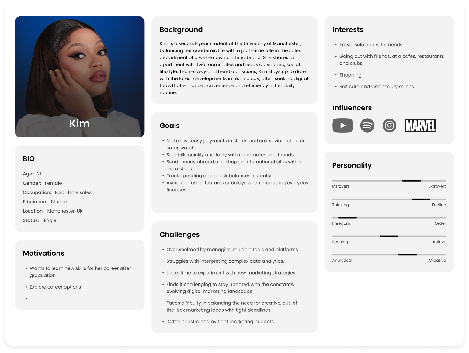
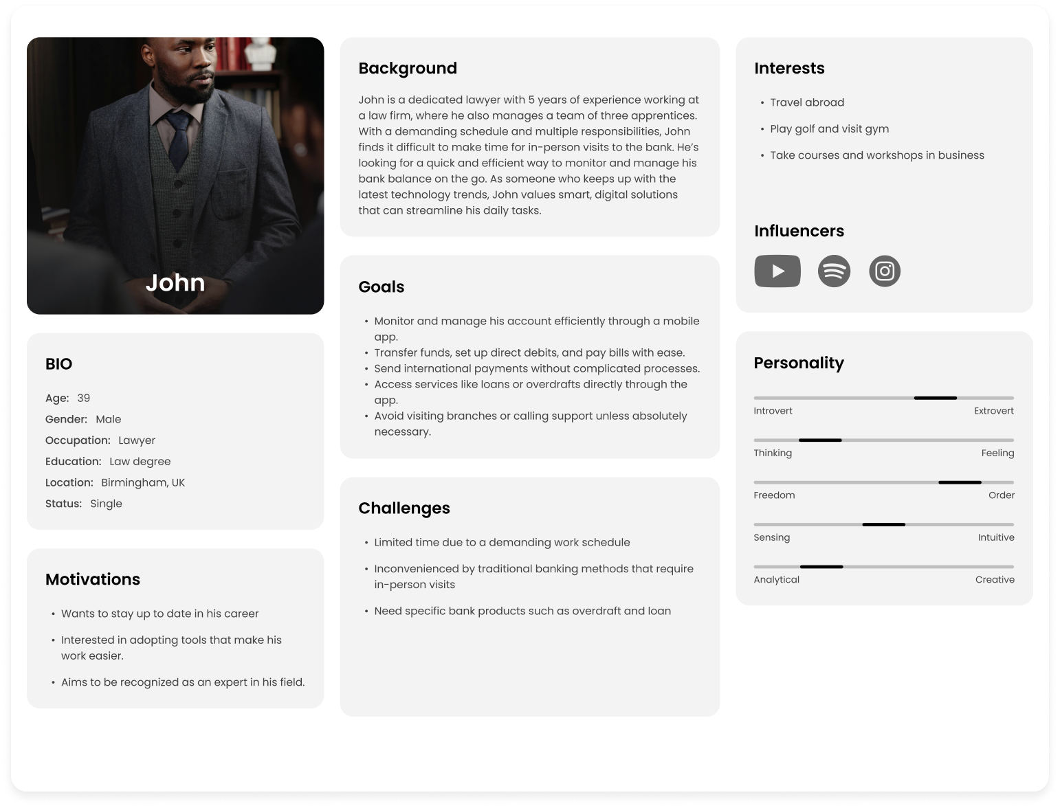
User Personas & Journey Maps
Below are the two proto personas–and their overlapping goals, motivations, needs, and pain points.

Problem Statement
After synthesizing insights from my research and interviews, I identified a key opportunity for the Coin app: helping busy professionals manage their finances with speed, clarity, and confidence. I used this understanding to shape the core problem statement and guide my design decisions moving forward.
“Time-pressed professionals like John need fast, intuitive access to financial information so they can make informed decisions without disrupting their demanding schedules.”
“Current banking apps often fall short by offering fragmented experiences and lacking personalized insights, which leads to user frustration, delayed financial decisions, and missed opportunities. By providing a clear, streamlined, and responsive banking experience, Coin can empower users to stay on top of their finances and build stronger, lasting relationships with the platform.”
Design Principles
My research insights helped me determine that the solution should deliver the following key benefits for users.

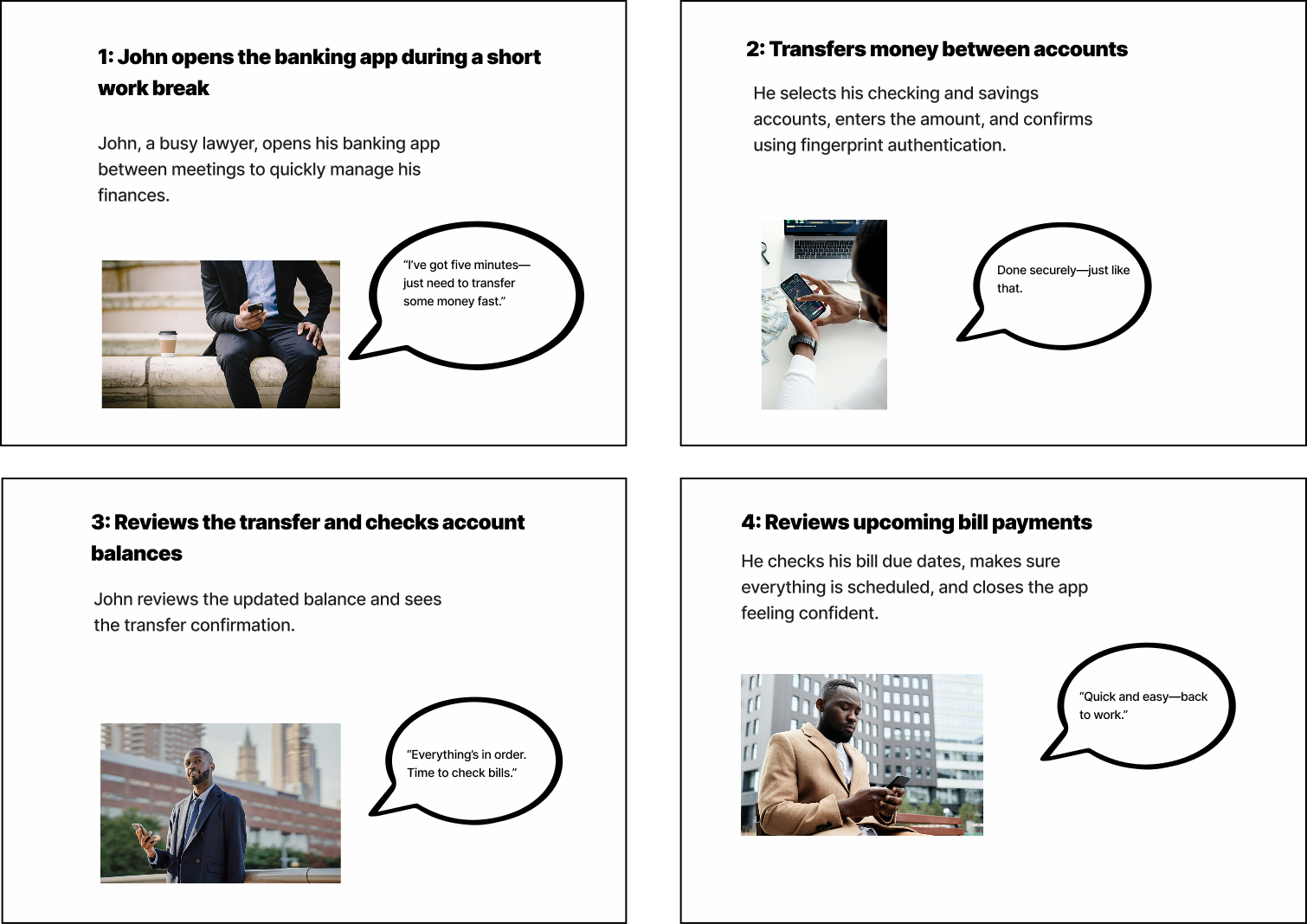
Context Scenario
John, a 39-year-old lawyer, is managing his finances on the go while balancing his demanding work schedule. He often has back-to-back meetings and doesn’t have the time to visit a bank or call for assistance. John is tech-savvy but prefers simple and efficient solutions that help him manage his accounts and keep track of his spending.
Today, he needs to quickly transfer money between his accounts and check if he has enough balance to pay an upcoming bill. He’s looking for a fast way to navigate his banking app and perform these tasks without having to search through multiple screens. His main concern is security, as he handles sensitive financial data regularly.
ideate
Types of Research methods I Performed
This is where it all started. I needed to define what I wanted to achieve with the product, understand the users’ needs, and figure out the best way to approach the project. To do this, I carried out several types of research to guide my direction.


style guide

Typography
Inter is a variable sans serif typeface created by Rasmus Andersson. Whether used at large or small sizes, Inter maintains great readability. Features a tall x-height to aid in readability of mixed-case and lower-case text. Not only does this make it easier to differentiate between upper and lowercase letters, but it also helps to create space between lines of text. This gives each line room to breathe, even at squint-inducing sizes.

Icons
Low-Fidelity Wireframes
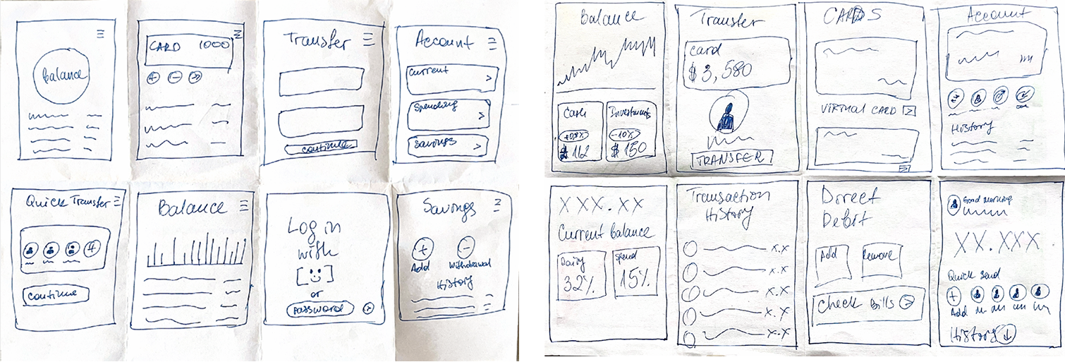
I wanted to visualize the user experience when interacting with the Coin app. By creating wireframes, I was able to define the layout and structure without focusing too much on visual details. This approach helped me explore different ideas, solve layout challenges, and iterate quickly without getting caught up in the finer design elements too early.

prototype
High-Fidelity Wireframes
I developed and iterated on high-fidelity screens, bringing the visual identity to life by applying the color palette, incorporating the logo, and adding graphic elements to enhance the card visuals. These refinements helped create a cohesive and engaging interface that aligned with the brand’s personality while improving overall usability and visual appeal.

results
What I Learned
Working on the Coin banking app taught me the importance of clarity and focus in design. At times, I was tempted to include too many features based on user insights, which risked complicating the user experience. This experience reminded me that simplicity often leads to better usability, especially in products that need to deliver quick, clear information like banking apps.
Over the course of the project, my design thinking skills grew significantly. I learned to separate my own assumptions from the actual needs of users and gained a deeper appreciation for research as a tool for both empathy and evidence. Creating personas, user stories, and style tiles helped me stay user-focused throughout the design process, and iterating based on feedback taught me how to balance creativity with real-world constraints.
FUTURE PROJECT RECOMMENDATION
Future Recommendations
While the prototype addressed the core flows of checking balances, transferring money, and paying bills, several opportunities emerged during testing and reflection that could further enhance the user experience:
1. Personalized Financial Insights
- Provide spending summaries, saving tips, and budget alerts tailored to user behavior.
- Helps Kim (student persona) manage limited income, and John (lawyer persona) get a quick overview of his expenses.
2. Biometric Security Enhancements
- Face ID / fingerprint login for faster access while keeping accounts secure.
- Especially valuable for John, who wants efficiency without compromising security.
3. Smart Bill Management
- Automatic bill reminders and one-tap payments to avoid missed deadlines.
- Allows users to set recurring payments for convenience.
4. Integrated Investment Features
- Light investment options (micro-investing, savings pots, or crypto support) for users looking to grow wealth directly inside the app.
5. Cross-platform Expansion
- Tablet-optimized layouts and a responsive web dashboard for users who prefer larger screens.
6. Accessibility Improvements
- Voice commands for quick actions.
- High-contrast mode and screen reader compatibility to ensure inclusivity.
