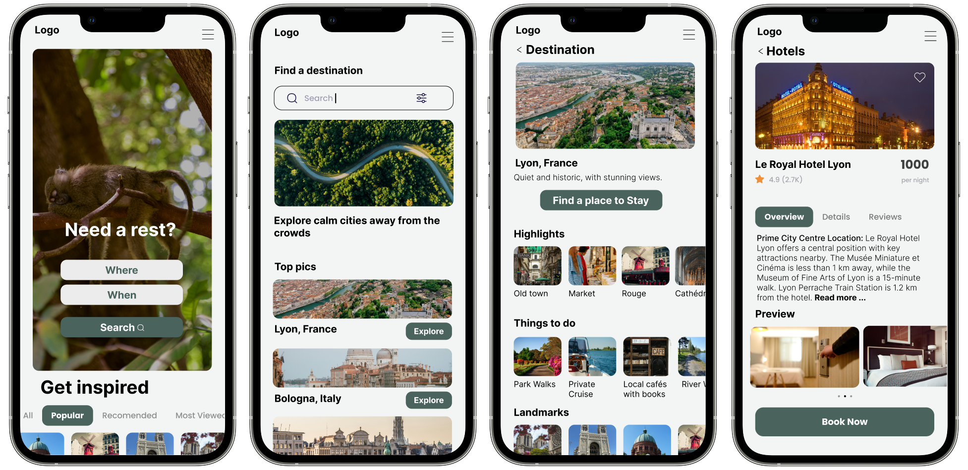
Hidden Gem is a travel platform that helps users discover underrated, stunning destinations — places that are breathtaking yet still quiet and crowd-free. The platform focuses on inspiration, discovery, and curated experiences, guiding travelers from exploration to booking with a calm, elegant, and intuitive interface.
project
Role - UX/UI Designer (Research, Wireframes, UI Design, Prototype
Tools - Figma
Designer - Debora Davidova
Timeline - 2025
Key Deliverables
- Competitive analysis
- User Interviews
- Affinity diagramming
- User personas
- User journey maps
- Problem Statement
- Design principles
- Use case scenario
- Formative testing
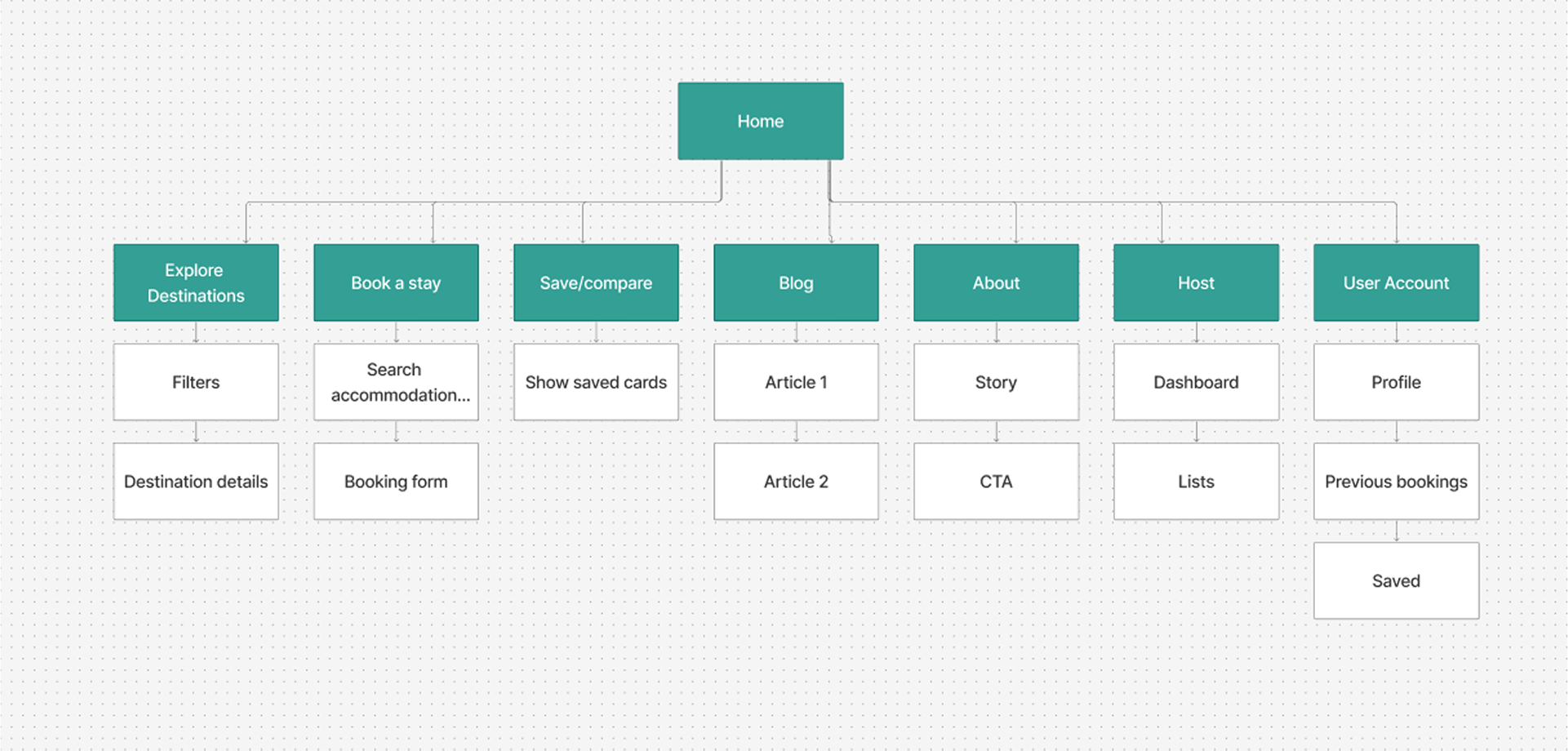
- Information Architecture
- Style guide
- Colors
- Typography
- Icons
- Lo-fi Wireframes
- Hi-fi Wireframes
- Prototype
Goals
- Inspire Discovery: Help users easily find underrated, beautiful destinations that they might not come across on mainstream travel platforms.
- Simplify Exploration: Create a clear, intuitive discovery flow so users can explore destinations without feeling overwhelmed.
- Build Trust: Provide reliable information, reviews, and tips to help users feel confident visiting lesser-known places.
- Curate Experiences: Highlight unique activities and experiences for each destination, tailored to different traveler types (solo, couples, families).
- Design a Memorable Experience: Deliver a calm, elegant, visually engaging interface that evokes inspiration and excitement for travel.
Challenge
- Balancing Content Richness with Clarity: Presenting enough information to inform and inspire users without creating clutter or cognitive overload.
- Designing for Trust: Ensuring users feel confident about visiting destinations that are less well-known, especially regarding safety and quality of experiences.
- Creating Intuitive Discovery Flows: Designing a platform where users can navigate easily from browsing inspiration to selecting a destination and planning next steps.
- Maintaining a Consistent Aesthetic: Crafting a calm and elegant visual design while still showcasing rich imagery and dynamic content.
- Limited User Data: With only 5 interviewees, making design decisions that are user-informed yet adaptable for future scaling.
APPROACH
The Approach That I Followed
To complete the project I followed the Jesse James Garrett’s method knows as the Elements of User Experience. This method allowed us to cut through the complexity of user-centred design. W e decided to use this method as gave us the big picture of the user experience development, from strategy and requirements to information architecture and visual design.

empathise
I began by exploring the problem space to better understand how travelers currently discover and book destinations. To identify opportunities and industry gaps, I conducted a competitive analysis of leading travel platforms, examining their discovery features, booking flows, and overall user experience.
I also reviewed user feedback in app store reviews and travel communities. Many travelers expressed frustration with platforms that prioritize mainstream locations, provide overwhelming choices, or lack inspiration. Others noted that it was difficult to trust lesser-known recommendations without reliable reviews and context. At the same time, they voiced a strong desire for platforms that help them find unique, quieter destinations while still feeling safe, supported, and inspired.
These insights shaped my design direction, ensuring that Hidden Gem would showcase a curated, trustworthy, and inspiring journey for users — simplifying discovery while highlighting the beauty of underrated destinations.
Research
I began by investigating the broader travel booking landscape, looking at both established platforms and emerging digital travel services. I focused on understanding how travelers plan, book, and manage experiences in a way that feels quick, reliable, and enjoyable.
My main goal was to explore the role a modern booking platform can play in supporting travelers who value both efficiency and inspiration. I wanted to understand how a digital solution could provide a seamless, premium, and trustworthy booking journey — empowering users to make confident choices that fit their personal travel needs and preferences.
Competitive Analysis
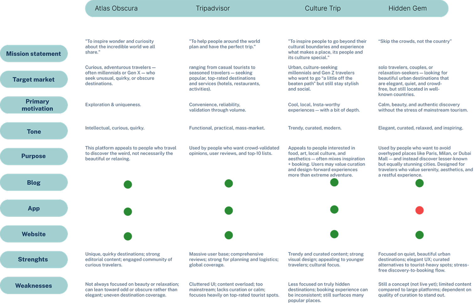
By conducting a competitive analysis we discovered the following:
- All three platforms — Atlas Obscura, Tripadvisor, and Culture Trip — offer a core set of features, including a website, mobile app, and access to travel content or recommendations.
- Only one of them consistently focuses on lesser-known destinations, but even that leans more toward quirky or unusual spots rather than elegant or relaxing alternatives.
- None of the platforms specialize in suggesting quiet, beautiful urban alternatives to mainstream tourist cities, and none guide users from discovery all the way through booking in a calm, curated interface.
- These findings helped me identify both common standards in the travel inspiration space and clear gaps — particularly around serenity, crowd-avoidance, and curation — that present a strong opportunity for Hidden Gem to differentiate itself.
User Interview
From my initial research, it became clear that modern travelers are seeking more than just popular destinations — they’re increasingly looking for authenticity, balance, and moments of peace within their journeys. To understand this shift more deeply, I surveyed five participants with varying travel behaviors, from relaxed getaways to cultural city trips.
I aimed to explore their preferences, planning habits, and frustrations, especially around finding destinations that feel rewarding yet not overrun by crowds. Many participants expressed a strong interest in quiet, beautiful, and lesser-known places, especially when their goal was to relax, recharge, or escape the stress of everyday life.
of participants said they would use (or consider using) an app that helps them discover beautiful, quiet cities that aren’t tourist-heavy.
said they prefer quieter or lesser-known destinations, especially for relaxation, recharging, or peaceful experiences.
said they had previously discovered a destination that felt like a “hidden gem” — usually places with natural beauty, local charm, and fewer crowds.
said they find travel ideas through social media, friends, or online research — but many noted that it can be time-consuming or difficult to find places that match their comfort and vibe.
mentioned that they balance both types of travel — enjoying famous destinations when appropriate, but preferring quiet when they need to rest or avoid stress.
expressed concern that if too many people used an app like Hidden Gem, it might lead to over-tourism in quiet places — signaling the importance of ethical curation and content strategy.
Summary Takeaways
These interviews helped validate the need for a platform that saves time, avoids the noise of typical tourist guides, and introduces users to authentic, beautiful, crowd-free places. While people still value cultural landmarks, there is a growing desire for restful, aesthetic, and immersive travel experiences — especially in cities that aren't constantly overrun.
define
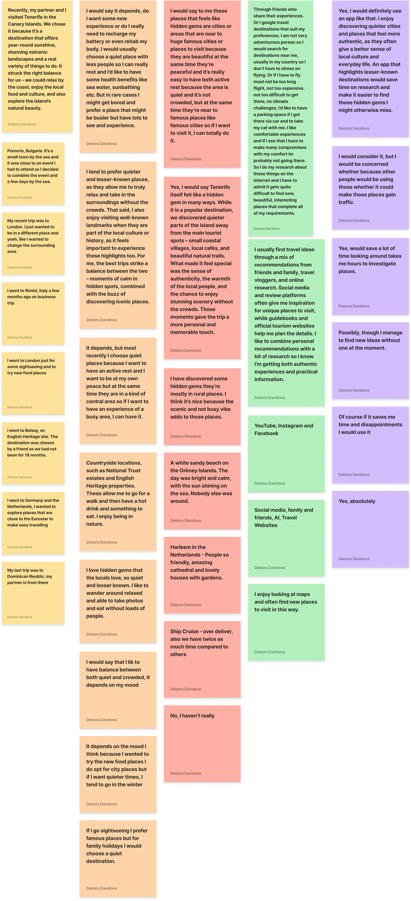
Affinity Mapping Sessions
I began with the first stage of the design process — aiming to develop an empathic understanding of the problem I was trying to solve. This involved exploring various research methods to uncover meaningful insights and guide my design decisions.
Secondary Research
As part of the affinity mapping process, I conducted secondary research using reviews from Trustpilot, Google Reviews, and travel-specific platforms like Tour Radar. The goal was to uncover common patterns in user satisfaction and frustration across various travel platforms.
Key frustrations included - misleading content, technical glitches, booking difficulties, and poor customer support, especially with platforms like Tripadvisor, Atlas Obscura, and Culture Trip. Notably, users often drew a clear line between poor digital experiences (buggy websites, lack of responsiveness, broken features) and high-quality on-the-ground tours that were well-organized and memorable.
In contrast, top-rated platforms like TravelPerk, G Adventures, and Trafalgar demonstrated the value of a streamlined, transparent, and reliable booking process, supported by strong UX design and excellent customer service. These findings helped guide the affinity mapping session by highlighting recurring themes around trust, usability, expectation gaps, and the importance of seamless digital-to-physical experiences in the travel platform.
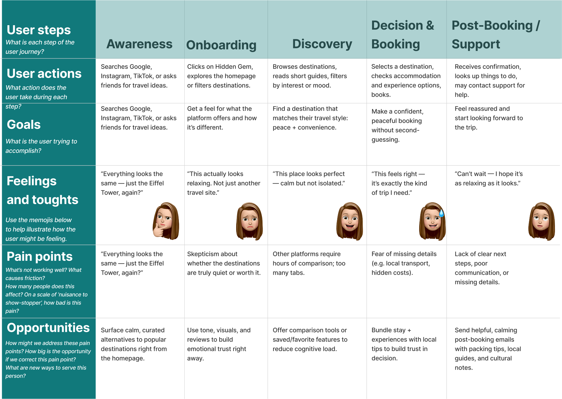
User Personas & Journey Maps
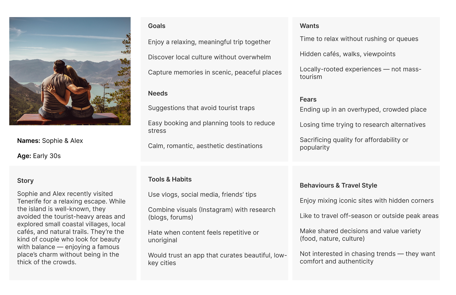
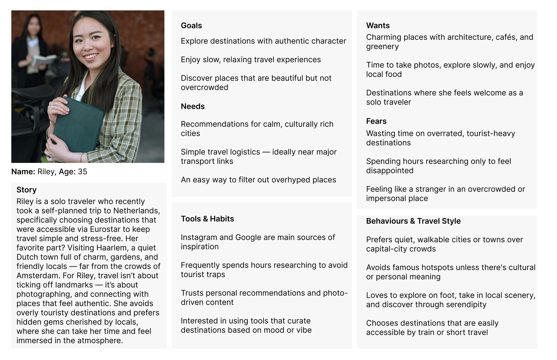
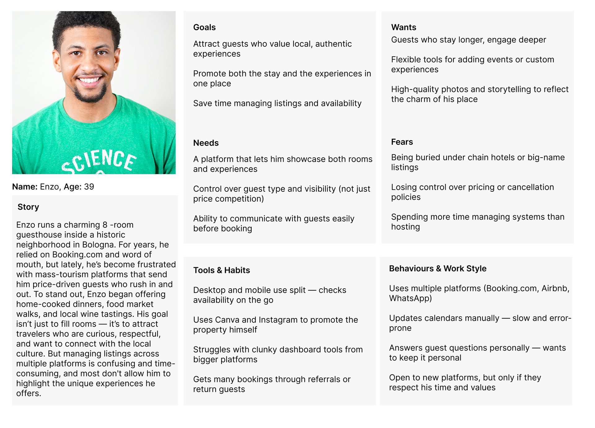
Below are the two proto personas–and their overlapping goals, motivations, needs, and pain points.
Problem Statement
After synthesizing insights from my research, surveys, and user journey mapping, I identified a key opportunity for the Hidden Gem platform: helping modern travelers find peaceful, beautiful, and culturally rich destinations without the overwhelm of mainstream travel planning tools. This became the foundation for the core problem statement and informed all subsequent design decisions.
“Curious travelers like Riley and couples like Sophie & Alex want to discover calm, inspiring destinations — not overrun tourist spots — but they struggle to find trusted, curated travel platforms that match their style and values.”
“Current travel platforms often overwhelm users with generic results, crowded hotspots, and influencer-driven content. This leads to frustration, decision fatigue, and uninspired bookings. By offering a peaceful, curated, and intuitive discovery-to-booking experience, Hidden Gem can empower travelers to feel more connected to their journey — and more confident in their choices.”
Design Principles
My research insights helped me determine that the solution should deliver the following key benefits for users of Hidden Gem.

Context Scenario
Riley, a 34-year-old solo traveler, is planning her next short trip while balancing a demanding remote job. She’s been feeling mentally drained and wants a peaceful getaway to recharge, but doesn’t have the time or energy to dig through endless travel blogs, tourist guides, or influencer content. Ella is tech-savvy and loves discovering places that feel authentic and under-the-radar, but she often spends hours trying to find options that match her preferences: quiet, beautiful, walkable cities that still offer cafés, public transport, and a bit of culture.
Today, she has a short window between work calls and wants to quickly explore calm destination ideas for a weekend trip — ideally something close to a train route, not too crowded, and visually inspiring. Her main concern is wasting time on generic platforms that promote the same popular cities. She’s looking for a tool that lets her filter by atmosphere and convenience, so she can discover and book a destination without overthinking it.

ideation process
Research methods I Used
This is where the project began to take shape. After conducting user interviews, analyzing competitors, and mapping out the user journey, I had a clear understanding of the problems users faced — and the opportunities Hidden Gem could address. Travelers were looking for authentic, peaceful destinations but were overwhelmed by generic search results and uninspired booking flows.
To move from insight to idea, I began the ideation process by sketching quick, low-fidelity concepts. Using the 6-8-5 sketching method, I generated multiple layout ideas to explore different ways to support discovery, comparison, and confident decision-making — all within a clean, calming interface.


style guide
Colors
Concept: Calm, elegant, and minimalist — reflecting peaceful, inspiring, and crowd-free travel.
I chose a calm and nature-inspired palette to reflect the emotional tone of Hidden Gem — peaceful, curated, and intentionally away from the noise of mainstream tourism.
Forest Green serves as the primary color, representing balance, trust, and natural beauty. It evokes the feeling of hidden gardens, quiet parks, and off-the-beaten-path cities — aligning with the platform’s promise of calm, inspiring travel.
Misty Gray is used as a soft secondary color, providing a neutral, breathable backdrop. It supports a clean and minimal interface that helps content stand out without creating visual clutter — especially important when users are comparing destinations or filtering by mood.
Warm Sand is reserved for accents and highlights. This soft, earthy tone adds subtle warmth to CTAs, tags, and hover states — gently drawing attention without overwhelming the experience.Text colors (deep charcoal and soft gray) are chosen for strong readability while maintaining an elegant, editorial tone.

Typography
Playfair Display is used for headings and large text elements to bring a sense of elegance and editorial sophistication to the interface. Its high contrast and classic serif form give Hidden Gem a refined look, ideal for a platform centered on curated, culture-rich travel experiences.
For body text, Inter or Lato are chosen for their clarity, warmth, and modern versatility. Both are clean, sans-serif typefaces that ensure excellent readability across mobile and desktop — especially when users are scanning travel info, guides, or destination details.
Inter’s tall x-height and open letterforms create breathable line spacing, while Lato adds a softer, more human feel when used in descriptions or UI labels. Together, these fonts strike the perfect balance between aesthetic calm and functional clarity, reflecting Hidden Gem’s tone: thoughtful, peaceful, and beautifully designed.

Icons

Low-Fidelity Wireframes
I wanted to visualize the user experience when interacting with the Hidden Gem app. By creating wireframes, I was able to define the layout and structure without focusing too much on visual details. This approach helped me explore different ideas, solve layout challenges, and iterate quickly without getting caught up in the finer design elements too early.
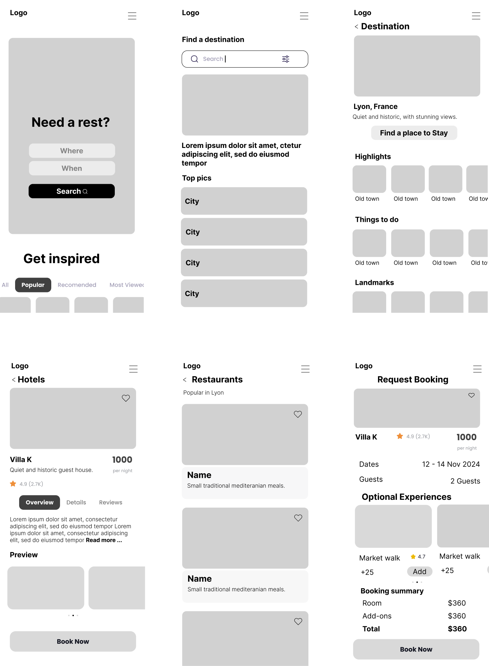
prototype
High-Fidelity Wireframes
I developed and iterated on high-fidelity screens, bringing the visual identity to life by applying the color palette, incorporating the logo, and adding graphic elements to enhance the card visuals. These refinements helped create a cohesive and engaging interface that aligned with the brand’s personality while improving overall usability and visual appeal.

results
What I Learned
Working on Hidden Gem deepened my understanding of how emotion, clarity, and thoughtful curation play a critical role in user-centered travel design. At first, I felt the temptation to include a wide variety of destinations, features, and filters based on user feedback. However, through iteration and testing, I learned that a focused, calming experience is far more valuable to users who are actively seeking peace, authenticity, and simplicity — not more noise.
This project sharpened my design thinking skills and pushed me to let go of assumptions, leaning into user research instead. Creating personas like Riley (the solo traveler) and Sophie & Alex (the couple) helped me keep real emotional needs — like clarity, peace of mind, and confidence in their choices — at the center of the experience. Designing mood-based discovery tools, booking flows, and curated city profiles also taught me how to balance storytelling with usability in a minimalist interface. Most importantly, I learned how powerful curation can be when done with empathy and restraint.
FUTURE PROJECT RECOMMENDATION
Although Hidden Gem already provides a curated and peaceful travel discovery experience, there are exciting opportunities to expand the platform further:
1. Smart Discovery Engine -Help users discover destinations based on mood, travel history, or browsing behavior.
- Example: Suggest “quiet cities with nature + walkability” for Riley based on saved favorites.
- Increases personalization and makes the platform feel more like a thoughtful travel companion.
2. Compare Destinations Tool- Let users compare destinations side by side (cost, atmosphere, ease of transport).
- Helps hesitant travelers make confident decisions faster.
- Could include badges like “least touristy,” “best for couples,” “great coffee.”
3. Host Spotlight Stories- Showcase trusted hosts and their favorite hidden spots in each destination.
- Adds human warmth and local flavor to the booking flow.
- Builds trust in unknown places through real people, not just data.
4. Multi-Destination Trip Planner - Allow users to build a peaceful itinerary across several quiet cities.
- Ideal for European rail travelers or those seeking extended, slow travel experiences.
- Could include smart groupings based on mood or proximity.
5. Accessibility Improvements- Ensure the experience is inclusive to all travelers.
- Add features like text resizing, contrast toggles, and screen reader support.
- Include filters for destinations with accessible transport or walkable streets.
6. Local Culture Layer - Integrate curated cultural experiences (art walks, quiet cafés, bookshops).
- Offers depth beyond booking — for travelers who want to feel connected.
- Could include audio snippets or visual storytelling for deeper immersion.
